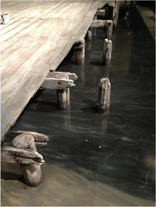
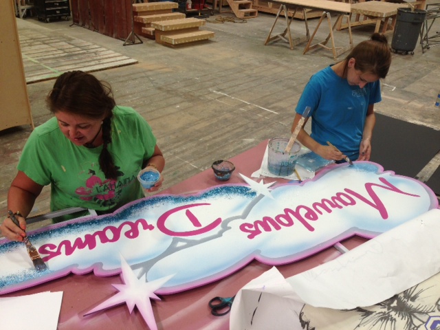
 After the outdoor season opened here at OSF, the rest of the season began to FLY by! We painted a beautiful deck for "The Liquid Plain" a new work by Naomi Wallace for our thrust stage that transports the audience to the docks of lat 18th century Rhode Island (Scenic Design by Brenda Davis). We painted another new work "The Tenth Muse" for our giant Bowmer stage. Discussing the works and life of poet, playwright and nun Sor Juana Ines de la Cruz, Richard Hay designed an imposing stone chapel-like structure. After my OSF season concluded, I flew down to Southern Utah to spend the Fall Season at Utah Shakespeare Festival, an old favorite of mine. I had the opportunity to work with Jo Winiarski once again (Scenic Designer: OSF's Taming of the Shrew) for a glitter-ific version of "The Marvelous Wonderettes!" and a beautiful marble "Richard II." 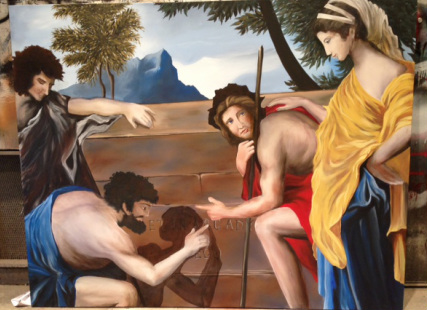 So many fantastic projects have come my way these past few months! First, for "The Liquid Plain," I painted a 7'x5' acrylic reproduction of Nicolas Poussin's "Et In Arcadia Ego," originally in oil and 35 by 47 inches. Many challenges arise from a project like this, and overcoming them is what makes our job so much fun! First, all that beautiful blending of the fleshtones can be easily done in oil, but acrylic dries so fast, even with medium, and glazes do not give the same effect. I had to work very quickly. Secondly, many scenic artists out there can commiserate on the difficulties of blowing up such a small piece. Little discrepancies not noticed in something so small become obvious when they become large. I had to correct these inconsistencies and make the figures look natural without compromising the artists original style. Last but not least, the time deadline. This piece took me about two weeks to complete. In the slideshow below shows a few process shots as well as the original image. I didn't fuss too much about making them look absolutely identical, as the designer asked the piece to be HEAVILY aged. The day I added the finishing stroke, the piece was cut. So I donated it to be sold at the fundraiser, the Deadalus Project, supporting people who are living with HIV and AIDS in the Rogue Valley.
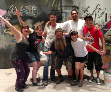
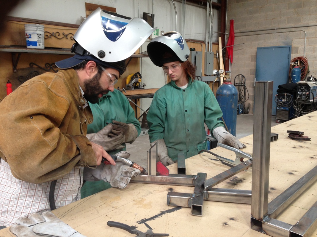
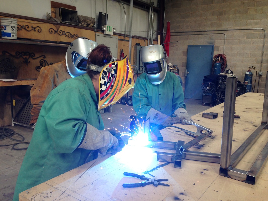
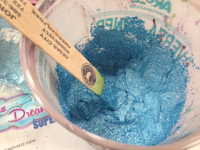
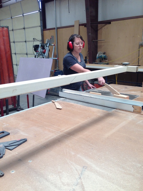
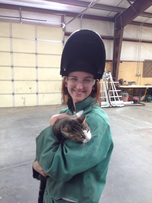
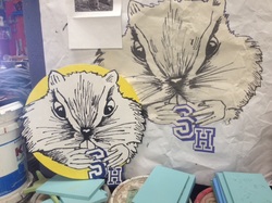 One of my favorite kinds of projects is foam carving. I LOVE to think three-dimensionally. This Fall, at the Utah Shakes Fest, I had the opportunity to carve a cartuche of the High School Mascot for "Marvelous Wonderettes," a chipmunk! We started with this source material, and scenic artist Liv Joyce painted the medallion pictured left. However, upon further contemplation, Jo Winiarski asked the piece to be carved in relief, and I was more than happy to oblige! All finished! I give you "Chives" the Chipmunk! 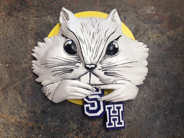 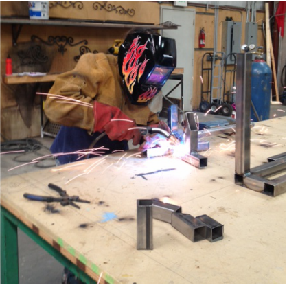 Oh yeah, also, I learned to weld- How awesome is that?!? Scenery Director Aaron Wilson gave the scenics a little class. That's him in the pics below patiently explaining the basics and letting us practice as much as we want. 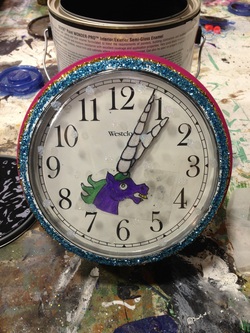 There have been so many other great projects and memories and friends! I hate to glaze over them, but today I start a new season, my third, back at the Oregon Shakespeare Festival, and can't wait to dive in feet first! So here's a little gallery of some of the cool and fun things I've gotten to do and work on over the last few months. Many thanks to Michelle Fullerton, the awesome Scenic Charge Artist of the Utah Shakespeare Festival, and to Scenic Artist Live Joyce, for the fun times, and the teamwork through the tough ones. You've both made this Fall a great one!
0 Comments
As part of the magical set for A Midsummer Night's Dream, Michael Giannio designed a larger than life stump for the fairies to frolic around and Titania to sleep on. The stump was a major project beginning with a 2x4 wooden base which we sent to Pacific Spray Foam, a company that coated our armature with a light expandable foam similar to Great Stuff. 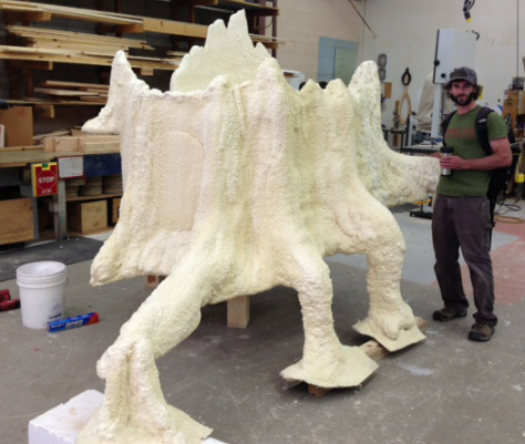 In this picture, you can see the true scale of our magic stump. 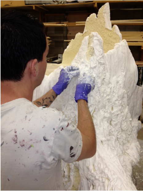 Lead scenic artist Thayne Abraham demonstrates our cheeseclothing technique. Lead scenic artist Thayne Abraham demonstrates our cheeseclothing technique. The foam was beautiful and just what the doctor ordered. It gave us a great base to work from. We could easily carve down into it in areas to give it some deep grooves. After some of the roundness had been knocked down, we began adding bark texture using strips of cheescloth dipped in glue. 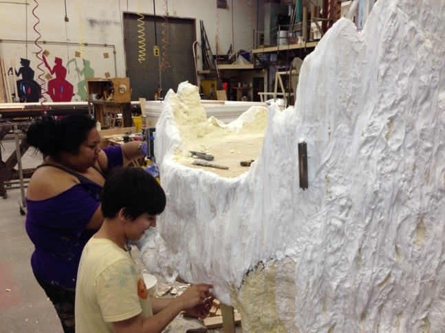 Assistants Leah Ramilliano and Anna Maria Aburto transform foam into bark. 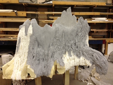 Next, we coated the stump in -our favorite- Jaxsan! This would not only weatherproof the stump, since Midsummer is an outdoor show, but it also unified the stump aesthetically and took us another step in the direction of realism. With all those bumps and grooves, it took a while. 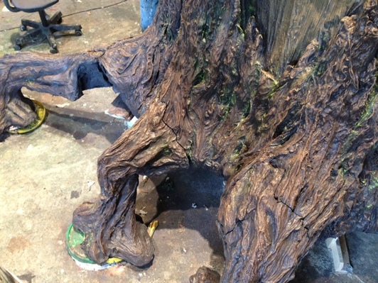 Closeup of the stump's removable roots. Closeup of the stump's removable roots. Our biggest issue was getting all of these thick layers of texture to dry in a timely manner. Since our shop is lovingly called "the sauna," we brought it in, cranked the heat even more, and basically cooked the giant stump in our giant oven. Then, all that was left was to paint it. We based it in brown with some added highlights and shadows. The scenic designer, Michael Giannio, also requested we work some of the floor colors into it to make it look "rooted." No pun intended. 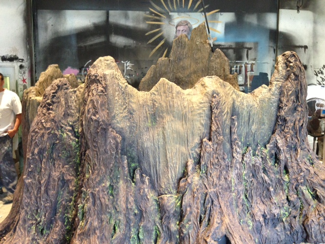 Our lead scenic, Thayne Abraham put the finishing touches on this beautiful piece. He deepened the shadows, added some variation in the wood, and even added some green fungus-like areas.
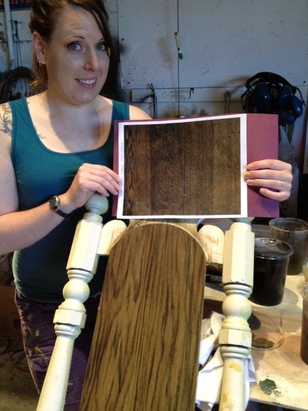 This week, I have been plugging away at a fancy table and chair set for "The Heart of Robin Hood." These pieces need to have a fine grain and look super realistic. They also have TONS of small pieces to them including dental molding and spindles! I took a look at the sample and said, "Here we go!" To the right you can see a picture of me color matching to the sample research. 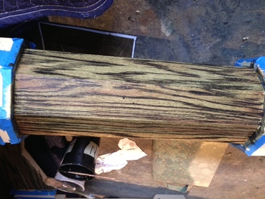 There were no tricks or ways around this one, I just had to hand grain the whole thing. Starting with a striated wet blend for a base coat, I added a raw umber glaze and flogged it, creating depth and movement. I grained after the raw umber glaze to preserve the punch of the grain I saw in the sample. Then I had an all-over glaze to bring the grain together. I love to add a touch of violet to my final glaze to give it a sweet touch. 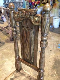 Here is the finished chair. As you can see, it had a LOT going on: the carving on the top was also mirrored below, and the spindles were especially challenging. I had to really think about how the grain runs through a piece of wood that gets turned. I used a real raw wood spindle for reference.
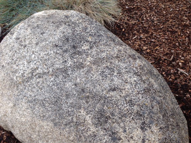
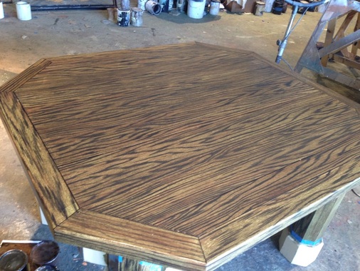 And here she is, the completed table! 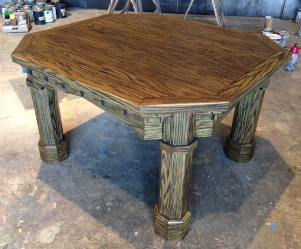 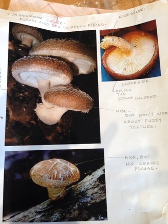 A page of research to work from. Given by scenic designer Michael Giannio. A page of research to work from. Given by scenic designer Michael Giannio. Our outdoor season is full of automation and magic. There are traps and roll drops, things to climb and swing on, doors to appear and disappear from- lots of places for fairies to hide. One entrance will be made through a giant mushroom large enough for a little girl to come through. It also needed to be short enough to easily be carried away by two other fairies. Due to these size and shape restrictions, the mushroom needed to be built and carved into a fairly unrealistic shape. It was up to me to paint this not-to-scale beastie to be magical enough to exist in the enchanted forest, but realistic enough that the audience would buy it's shape. 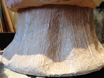 The stump was based in a nice cream, then washed with a slightly darker cream (+ a bit of burnt sienna) to deepen the valleys. Using an airbrush, I brought the burnt sienna down from the top of the stump and blended it out into the cream as I went down. I used a similar technique at the bottom to bring in the color of the floor to root the mushroom in the space. A drybrush of near white brought out the high points, and lastly, a shadow was added. 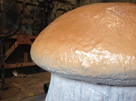 The cap was almost completely airbrushed. The lip was white peeking over from the delicate underside. The white soon became a raw sienna followed by a burnt sienna, a burnt umber right at the halo, and then back to burnt sienna again. Last the very top was kissed with a translucent white to make it look almost imperceptibly brighter. 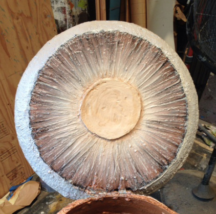 The underside of the cap was tricky because the shape of the stump was not to scale with the cap. If I had painted it the way it was physically, it wouldn't make sense. The eye knows what the bottom of a mushroom cap looks like, so, I thought, better give 'em what they want. I sculpted the center disc from clear matte gel, a product we order from Nova. I tried to give it a slight bit of texture so it would read as being popped off or broken off. I then added textured gills radiating out from it, and darkened the area where the gills meet the edge of the cap to faux in depth there. 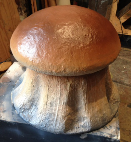 And here it is- the finished mushroom. Convincing?  Working outside in the Lizzy can be an exposure to the most extreme elements, but we have been so lucky to have beautiful weather while we fit and touch up the outdoor shows. First, a little update on what's been going on lately:  Here is the finished inner above now that we have tied together the ceiling and painted the floor in place to match. 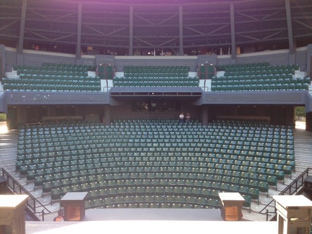 Here is the view of the house while standing in the inner above. 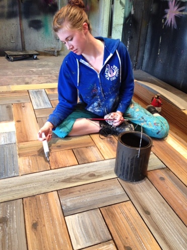 Our second long week has been SUPER productive. While Thayne, Amanda and I have been leafing like crazy, our new paint shop assistant, Leah Ramilliano and Erin have been working on the floor for the outdoor shows. Here you see Erin making sure all of the cracks in between the boards get painted using a syringe. They used jaxsan to create woodgrain texture, even sculpting knotholes. 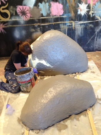 The sets also call for some realistic large bouldars. These were carved from foam and coated with fiberglass to make them near indestructible since they need to withstand the weather and use outdoors for all three shows and for several months. Here Amanda coats the rocks next with Jaxsan (our miracle material) to begin giving them a rock-like texture. 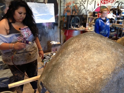 Leah puts a finishing touch of a gloss spatter on one of the boulders. Below a finished painted rock sits on the set. Right, a real rock I found in some landscaping. Not bad, right?
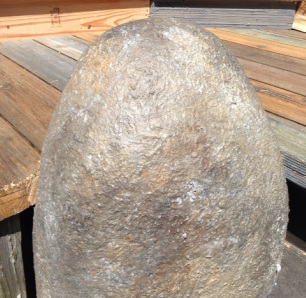
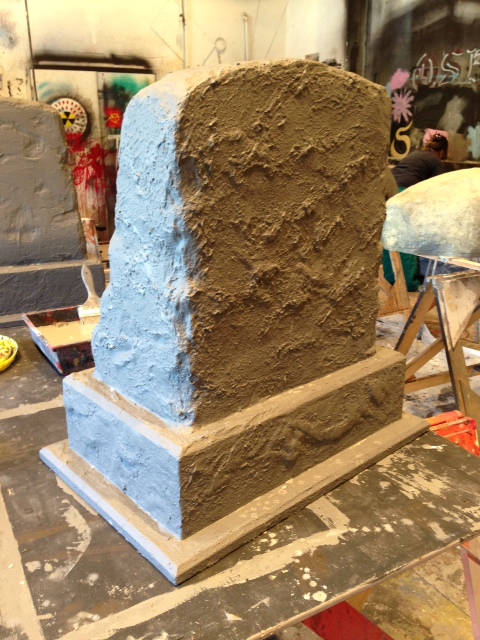
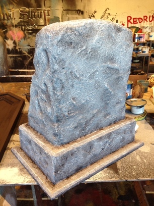
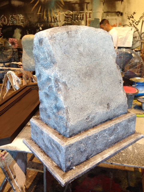
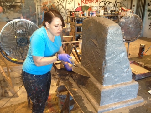 This wee I had the chance to work on two gravestones for Cymbalene's Mother and Father. Made up of a wooden base and a carved foam top, these gravestones need to be durable enough to sit and stand on, just like real stone. Here I am using jaxsan again to give the headstone a stone-like texture.
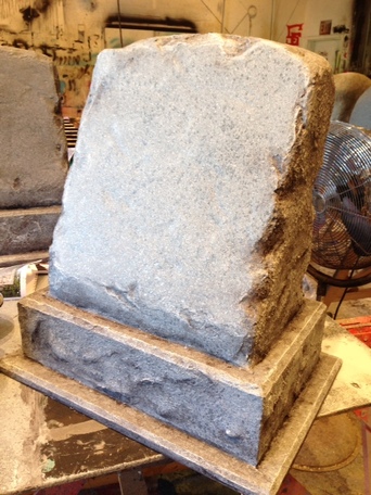 Next, the stones were given a quick paint job using a scumble with sponges and a series of spatters. For a final touch, I spattered with first flat and then gloss sealers to give the stone a little glisten like granite. Next, I added some shadows and contours and a super white drybrush to bring out the highlights in the texture.
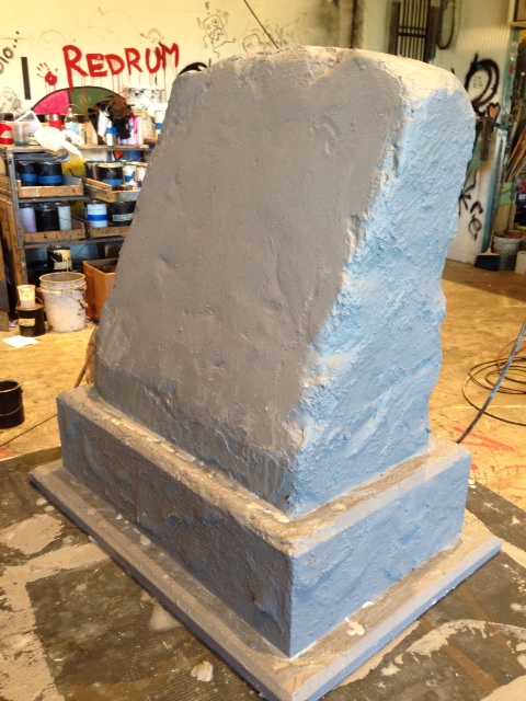
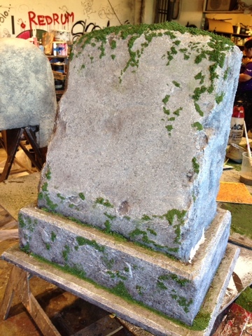 Now we have new gravestones. Cymbalene's parents have been dead for 20 years, so we need to make these graves look like they have been exposed to the elements for 20 years. Erin and Leah have created several gallons of "moss" by coloring powdered sawdust with green paint. Using glue, I clumped the sawdust on in places where water would gather and moss would grow. 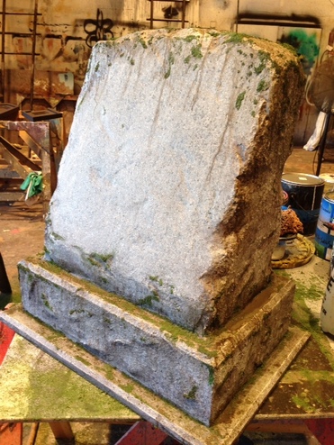 Now to begin the aging process. First a drippy raw umber glaze. Next I'll add a super dark as well as a super light lime green to bring out the moss. 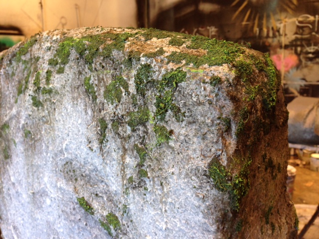
Here are the finished gravestones! Ready to mark some graves! 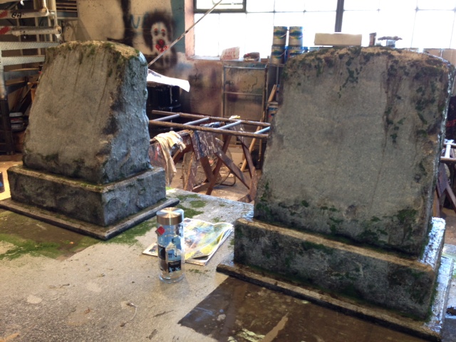
Check this out: I was featured in a few "snapshots" on the osf website! 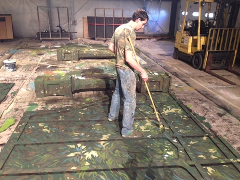 The sun is shining, temperatures rising- time for the summer season to get started! This year, the three outdoor shows will be sharing a common Scenic Designer, Michael Giannio, as well as a common main setting with changing secondary elements. The main set is supposed to give the flavor of a stylized forest. When the doors to the inner above and inner below slide away, however, a realistic forest is revealed. In order to achieve this effect, we are painting pieces of the actual Elizabethan stage as well as pieces special built by our shop to look like pieces of the Lizzy. 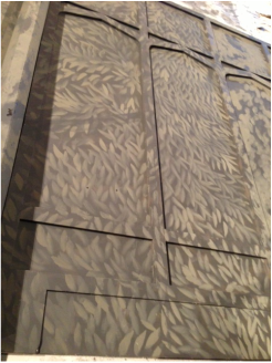 The first step to making this foliage is to start creating layers beginning with our darkest colors and working up to our brightest. Here, you can see the brown leaves we painted to get the layers started. 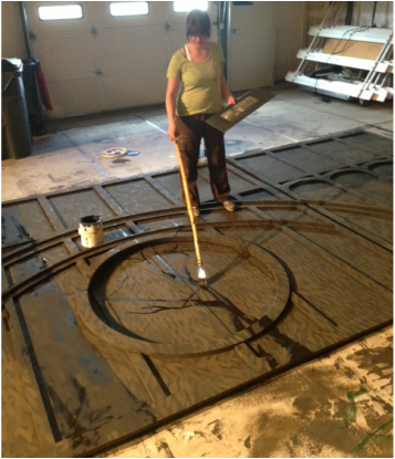 Next, Amanda assesses the renderings and finds the trunks and branches. 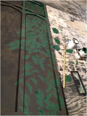 Next we start to make shapes by adding areas of green leaves around the branches. Below, Thayne adds highlights and shadows to the leaves. 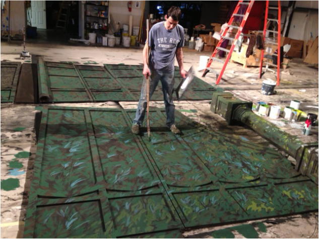
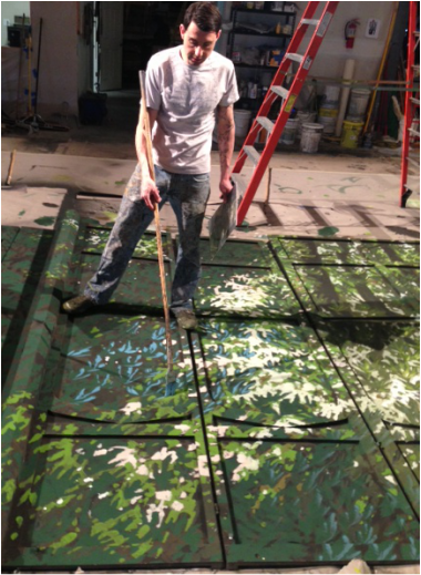 That was the easy part. Now it's time to fill out those branches! The light coming through the branches is added at this time to retain it's brightness. Clumps of brown dead leaves are added as well as bright bright yellow greens fading into the white of the sky. Any branches closer to the viewer are added or punched up. We also use this stage to differentiate one group of leaves form another. This is where we really make the flats look like the renderings. 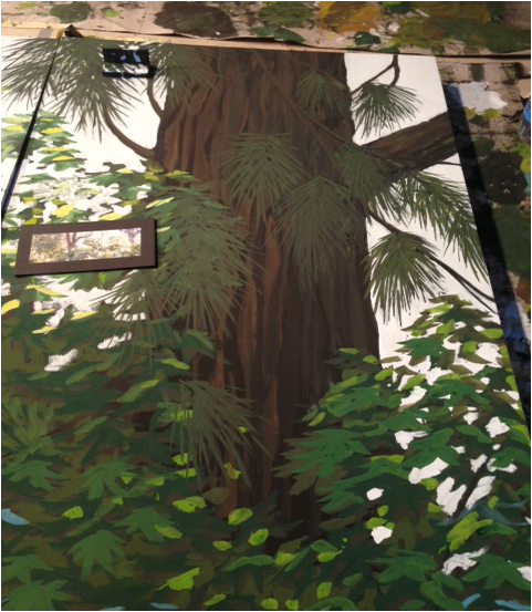 Sometimes there's even something a little unexpected. 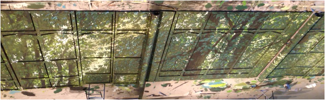 Here's our forest! 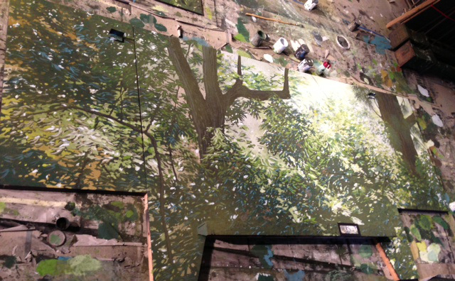
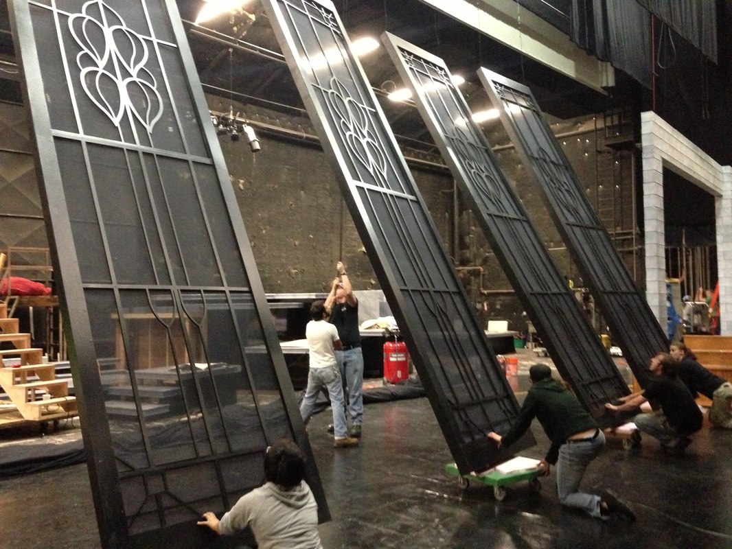
  Streetcar is really coming together in our shop. We've seen the wallpaper go up, the plumming and waterworks being put in, grand spiral staircases, and even a real claw-foot tub. Last but certainly not least, the biggest scenic element to this show has been completed and is being installed. The detailed window was quite a process, but with Thayne and Amanda on the job, it was cake. In a previous episode, we showed you how we projected the design onto the paper covering the plexi and then cut them out as in the picture at left.   The picture at right shows the painted plexi as the frisket is removed by lead scenic artist, Thayne Abraham.  
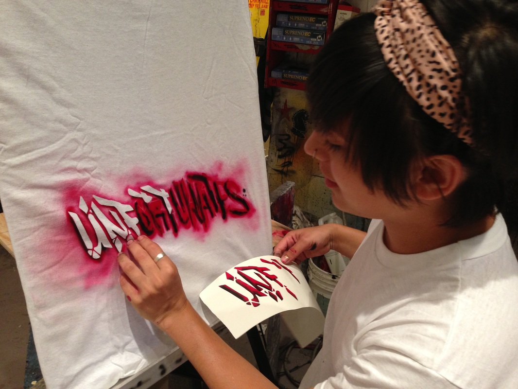
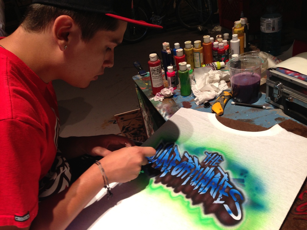
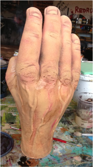
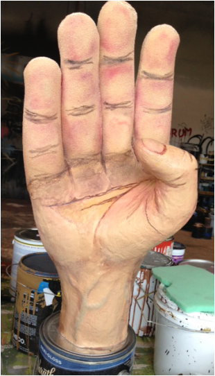
 Now, the carpenters work to frame and gasket the window as well as rig the water effects. Here, our scenic technology intern, Alex displays the bottom section of the window, completed and framed and put on a cart to go to the theater! 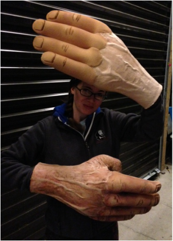 Last week, we opened our new musical, The Unfortunates. So , we needed to put the final touches on a few of the props. Namely the hands. The Unfortunates employs two sets of hands for Big Joe. Our awesome props artisan Annette Julian sculpted and cast giant realistic fists out of silicone. In addition, a set of fists that open into hands needed to be made. A tall order, even for us. But luckily, Annette, our local genious, came up with a fantastic solution: a mechanical robot armature that allows each finger to flex and release with the pull of a handle inside. Unfortunately, the flexible armature of the fingers could not be covered with the same silicone material that the palms and fists were due to their need to stretch and retract. Annette used a stretchy foam witch worked great but didn't match the texture of the silicone. The task was given to me to make these two very different materials look similar under stage light. 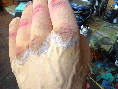 The most obvious difference between the two surfaces were their textures. So, the first thing I tried to do was make the transition a little more fluid between the two materials. I used a clear, flexible texture gel to fill in some of the holes of the foam while softening the edge of the silicone. 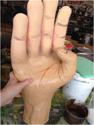 Next, I mixed a color to match to flesh tone of the silicone palm, and painted the texture paste, blending it into the rest of the foam a little bit. Now we have two surfaces with a common base. The next step was to shade the skin similarly on both materials to make them blend into one.
Below, you can see the final result. A natural looking hand- and you can barely see the transition between materials!
Every year, the scene shop has a party for the whole company. It's a big themed blow out with costumes, drinks and food, dancing, karaoke and activities. As I mentioned in this blog before, a new production building is in our future. It would be an understatement to say that we are SUPER excited about our new building. However, it will mean a big and permanent change to she shop party. It will be the end of the shop party as we know it. In honor of this sentiment, this year our theme is: "Arma-Get-it-on: the Great Shopocolypse." 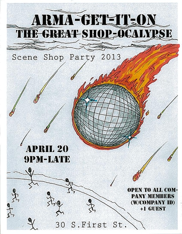
Above is the poster I designed for this year's party. I'll be painting a mural with the same theme on the paint shop wall, so be on the lookout for those pics to come later in the month!
| ArchivesOctober 2013 
Leave a Comment!
I'd love to hear from you. |
| Cassandra Phillips |
|


 RSS Feed